SOFT COLOR. KEEP THE PORTRAIT.
Pastel Photo Editing: Soft Color, Readable Portraits
Follow a restrained pastel editing recipe and four checks for believable skin, gentle color, dark detail and a useful source comparison.
Try the idea on your own photo with Stunna.


Free to download. Pro options available.
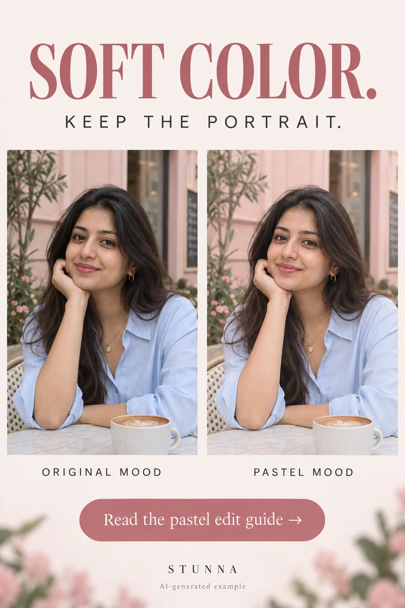
Pastel edits feel appealing when pale pinks, greens or creams belong to the scene and the person still has presence. Turning everything brighter and less colorful can flatten a portrait instead. Build the look around one or two colors, keep a little depth, and compare with the original. This guide gives you the pastel recipe and all four checks from the Pin. The comparison is an AI-generated illustration, not an actual Stunna result or a verified app before-and-after.
Choose a source with colors you want to keep
Choose a readable face and a few colors that work together. A pale wall, muted flowers or soft clothing can carry the mood with little color shifting. With harsh neon lighting, decide whether to preserve the moment or create a more obvious interpretation.
Save the source separately. Choose one strong background color and one supporting outfit or scene color to guide the finish. Avoid recoloring the person's skin just because pink or cream is part of the palette.
Recipe step 1: balance light and the unwanted cast
Make the face readable before changing the palette. Adjust exposure gently and watch bright areas such as the forehead, pale clothing and sky. If a strong unwanted color cast covers the scene, move the white balance toward a more believable starting point while retaining the mood of the light. Keep shadows that describe the cheeks and clothing.
[Adobe's color-editing guidance](https://helpx.adobe.com/lightroom/web/edit-photos/apply-effects/adjust-color.html) separates temperature, tint, vibrance and saturation, and offers a Color Mixer for targeted colors. In an editor with those controls, use them for distinct decisions instead of moving every slider in the same direction. There is no universal numeric recipe that fits every source.
Recipe step 2: soften the supporting colors gently
Reduce one overly vivid background color slightly, then review the portrait. A gentle change to foliage or a wall may be enough. Use targeted colors or masks where available, protecting the face. Inspect lips and clothing too, because color ranges can overlap.
Keep an accent such as a ribbon or bag if it helps the person stand out. If greens turn gray or the face looks chalky, reduce the adjustment. A dreamy palette can still feel connected to the source.
Recipe step 3: preserve a few dark details
Keep enough contrast for eyes, hair and clothing. If you raise dark tones for a faded finish, retain separation in lashes and folds. A black jacket should still have shape instead of becoming one pale gray patch. Avoid brightening every shadow equally.
Add grain or softness only if it helps. Inspect the saved picture at small size, where delicate effects can look muddy. The film-grain guide provides a separate texture review so grain and color stay deliberate choices.
Four checks for pastel without washing out the portrait
Put the source and edit side by side at the same crop. These four checks are the decision points promised on the Pin. If one fails, reduce that part of the edit rather than making the whole photo brighter again.
- Keep skin believable. Compare the face, neck and hands with the source; avoid a palette that lightens or recolors the person.
- Soften color gently. Check that pinks, greens and creams still describe the scene instead of making everything dull.
- Hold some dark detail. Keep eyes, hair, clothing folds and a few background lines readable.
- Compare before saving. Review the same crop at full and feed size, then inspect the exported file.
Keep the palette connected across a small photo set
Choose one portrait as the reference mood, then edit a detail and wider scene beside it. Match light, color and contrast relationships rather than every setting. Window and street photos may need different exposure and white balance.
For generated looks, check identity, hands and outfit too. Keep the original when details drift. The weekend photo-dump guide helps choose a sequence once the colors connect; clear moments matter as much as the finish.
The free vintage filter offers another finishing option. Compare a restrained faded finish on a copy while retaining believable skin and dark detail.
Plan the next frame
To balance a bright background with a readable face, use the guide to backlit portrait tips. To give your hands a natural job in a quiet setting, use the guide to bookstore photo poses. To check texture at full size and feed size, use the guide to film-grain photo editing. To sequence portraits, settings and small details into one story, use the guide to a weekend photo dump.
To balance a portrait against a bright snowy background, use the guide to snow-day photo tips. To review skin tone, texture and identity against the source, use the guide to natural-skin photo edits.
A few useful answers
Do pastel edits require brighter or lighter skin?+
No. Build the palette through the scene and supporting colors while preserving the person's original skin tone. A pastel background can sit around a portrait with its original depth and contrast.
Why does my pastel photo look flat?+
Check whether the darker details disappeared or every color was desaturated equally. Restore some separation in eyes, hair and clothing, then make smaller changes to selected background colors.
Should I reuse identical settings on every photo?+
Use them as a starting point only. Different lighting and source colors need different adjustments. Compare the mood across the set, and inspect each face and exported image separately.