THE FILM-GRAIN EDIT
Film Grain Photo Editing: Keep Texture Balanced
Compare subtle, balanced and heavy film grain, then use four checks to keep texture and faces readable in the photo you actually share.
Try the idea on your own photo with Stunna.


Free to download. Pro options available.
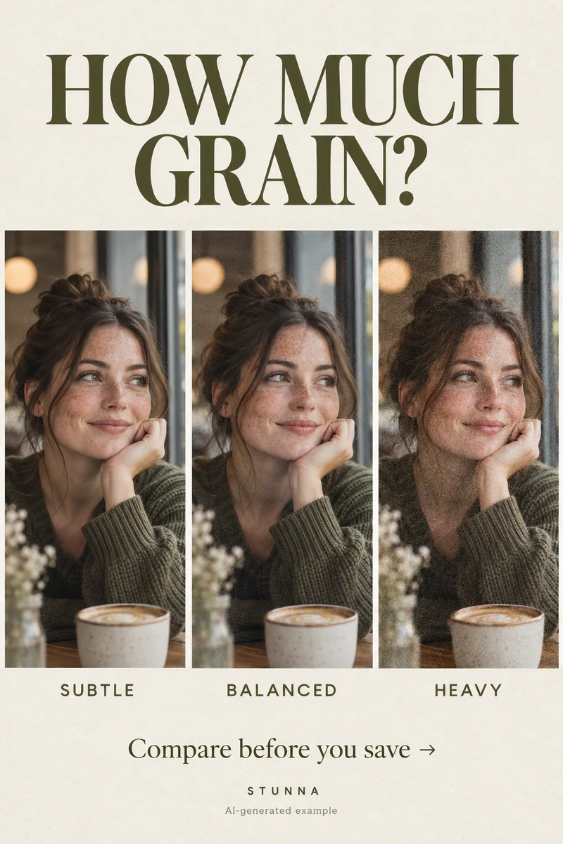
Film grain can give a clean phone photo a softer, more tactile finish. The useful question is how much texture the picture needs at the size people will see it. A grainy preview that looks beautiful when enlarged may feel muddy in a small feed. This guide compares three creative directions and gives you four checks before saving. The visual comparison is an AI-generated illustration, not a controlled editor test or an actual Stunna result.
Start with a photo that already works
Choose a sharp picture with enough light to see the eyes, fabric and background shapes. A quiet wall, clear sky or simple coat makes a useful practice image because the texture is easy to notice. Keep an untouched copy. Set your crop and make small brightness or color corrections first, so you are judging the grain against the final composition.
Strong digital noise may already make a dim image hard to read. Grain cannot recover missed focus or lost shadow detail. For a gentle warm color direction, see the warm film photo guide.
Compare subtle, balanced and heavy
Make three versions from the same original with the same crop and color. These are creative labels, not universal slider values: different editors, photo dimensions and grain styles produce different results. Compare the versions side by side rather than repeatedly adding an effect to an already edited file.
- Subtle: the face stays visually clean, while plain walls and midtones have a faint texture. Try this direction when the expression or outfit detail should lead.
- Balanced: texture is clearly part of the picture but does not compete with the eyes, jewelry or lettering. Try it for an everyday portrait or a connected weekend set.
- Heavy: grain is a visible stylistic choice across the frame. Try it on a graphic scene with a strong silhouette; reduce it if fine details become difficult to distinguish.
Separate the amount from the character
In an editor that offers separate controls, grain amount describes how strongly texture appears; particle size and roughness change its character. [Adobe’s Lightroom Classic guide](https://helpx.adobe.com/au/lightroom-classic/desktop/process-and-develop-photos/retouch-photos.html) explains those controls and recommends checking the effect at more than one zoom level. Those are Lightroom controls, not a claim about controls in Stunna.
For your own comparison, change one quality at a time. If the texture looks like large dirty spots, try finer particles before reducing all of it. If a face looks scratchy, compare a smoother texture. Keep contrast steady while you decide, because darker shadows can make the same grain treatment feel stronger.
Use the four final-export checks
Judge the saved image as well as the editor preview. Export a candidate at the dimensions and quality you intend to share, then reopen it in your photo viewer. Our four checks turn the Pin’s short list into a practical review:
- Check at full size: enlarge the export and inspect texture in a plain background, around eyelashes and across fabric. Look for coarse blocks or sharpening halos.
- Check at feed size: reduce the image to a normal phone viewing size. The subject and expression should still register before the grain does.
- Keep faces readable: check eye outlines, skin texture and small facial features. If they merge into the effect, choose a lighter version.
- Save once at good quality: return to the original or editing project for changes, then make one final export. Avoid repeatedly editing a compressed social download.
Keep a set connected without forcing one strength
A grain treatment can connect a photo dump, but a dark restaurant portrait and a bright landscape may need different strengths. Start with one shared color direction, then choose the lightest texture that supports each image. Keep a close portrait gentler if its eyes lose clarity, even when a wide street scene carries heavier grain well.
Compare the set as thumbnails. Revisit any image that looks noticeably dirtier or more contrasty. Connected photos do not require identical settings; the weekend photo-dump guide helps choose the sequence.
Save the version you will want later
Keep the original and chosen edit in separate files with clear names. Ask anyone pictured whether the texture suits their portrait. For an AI finish, compare identity, hands, accessories and background details as well as grain. A film mood only works when the details you care about survive; use our AI photo editing checklist for that review.
The free add grain to a photo offers another finishing option. Adjust the texture on a copy and compare it at the sizes described above.
Plan the next frame
To build a five-shot story around a celebration, use the guide to birthday photo ideas. To give your hands a natural job in a quiet setting, use the guide to bookstore photo poses. To keep dark fabric and layers readable, use the guide to all-black outfit photos. To sequence portraits, settings and small details into one story, use the guide to a weekend photo dump.
To add movement while keeping the face readable, use the guide to creative motion photos. To review skin tone, texture and identity against the source, use the guide to natural-skin photo edits. To soften color without washing out the person, use the guide to pastel photo editing. To give the face and hands space away from distorted edges, use the guide to fisheye photo framing.
A few useful answers
Is film grain the same as digital noise?+
They can look similar, but this guide uses grain to mean an intentional film-inspired texture added for style. A dim phone photo may already have unwanted noise. Adding more texture is not a reliable way to restore missing detail.
What grain value should I use?+
There is no single value that works across editors and photos. Compare subtle, balanced and heavy versions of one image, then judge the final export at full size and normal phone size.
Can Stunna give me exactly the same grain on every photo?+
AI look results vary with the source image. 35mm Film and Faded Film offer creative directions; they do not promise identical grain particles, slider values or unchanged detail across a whole set.